

Derek Melchin
|
CPI Trading Strategy Out-of-Sample TestingIf an algorithmic trading strategy has a lot of rules or parameters, it can easily overfit to historical data. An overfit strategy models the past very closely, so it can produce profitable backtest results. However, an overfit strategy usually isn’t robust enough to perform well on unseen data, so it underperforms in live trading. One of the best ways to test if your strategy is overfit is to test it on out of sample data. Kevin Davey often talks about leaving new strategies in an “incubation period” before trading them with real money. The incubation period is a period of time after you develop the strategy where you don’t trade the strategy with real money but you just see how it performs on new data that wasn’t available when you originally developed the strategy. If the strategy performs favorably during the incubation period, it can give you more confidence that the strategy is robust enough to continue to work well on new live data. In September 2022, I shared the Consumer Price Index Strategy on the QuantConnect forum. Since I shared this strategy, there has been about 2.5 months of new data generated. In the original backtest, I tested the strategy from September 2009 to September 2022 and the strategy achieved a higher Sharpe ratio than the S&P 500 Index ETF, SPY, during the same time period. This algorithm has been cloned 133 times so far, so today, I’d like to revisit it and test it on the new data, a true out of sample test. Collecting New DataThere have been 2 CPI announcements since I last tested this strategy. To collect the new data, I downloaded the official CPI rates from the US Bureau of Labor Statistics website. Since I originally shared the strategy, there have been two new CPI data points that have been released. I downloaded them and I was able to get their official release dates from the archived news releases. I uploaded the new data to Dropbox so I could import it into the algorithm. The time series contains two new data points since the strategy was originally shared. 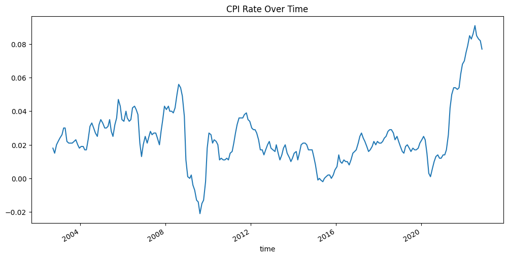
How the Strategy WorksTo clarify how the strategy works, everytime the new CPI rate is released, we compare it to the previous CPI rate. If the CPI rate increases, we identify the current market regime to be in a state of rising inflation. The following image shows the periods of time where the CPI data points were increasing. Green zones represent areas where the inflation rate was increasing. Red zones represent areas where the inflation rate was not increasing. 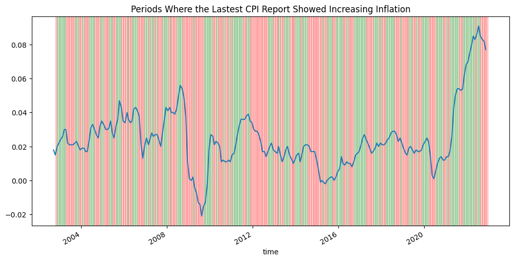
The universe consists of all 500 rolling stocks in the benchmark ETF, SPY. Everytime a new CPI rate is released or the universe changes, we rebalance the portfolio. During each rebalance, we look at the trailing year of data to determine which Equities to invest in. The following image shows the CPI rate over the last year and the zones of increasing inflation. 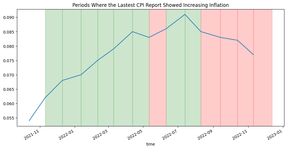
Note that in the image above, there is a red zone between May 11, 2022 and June 10, 2022 even though the line that represents the CPI data is increasing during that time period. This period of time is in a red zone because the CPI rate on May 11, 2022 is lower than the CPI rate on April 4, 2022. As a result, before the next CPI release on June 10, 2022, the trailing two CPI releases showed that the inflation rate was falling. Also note that in the image above, the last zone is red. Since the most recent CPI rate was lower than the previous CPI rate, we are no longer in a state of rising inflation. If we rebalance today, we take the trailing 1 year of pricing data for each asset in the universe. Take, for example, the trailing prices of XOM. If we apply the same zone highlighting, we can see how XOM performed during periods of rising inflation and periods of time when inflation wasn’t rising. 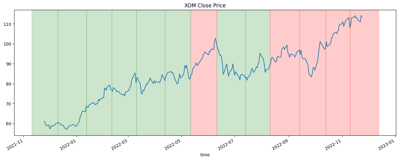
During each rebalance, we take the subset of trailing history that matches the current market state. In this example, the current market state is red, so we only take the closing prices of the red zones. With this subset of data, we can calculate the annualized Sharpe ratio of the security during times that match the current market environment. We do this for all the 500 stocks in the universe. We rank all of the stocks by their annualized Sharpe ratio given the current market state and select the top 25% of stocks. We then form a market-cap weighted portfolio of the stocks, holding until the next rebalance. 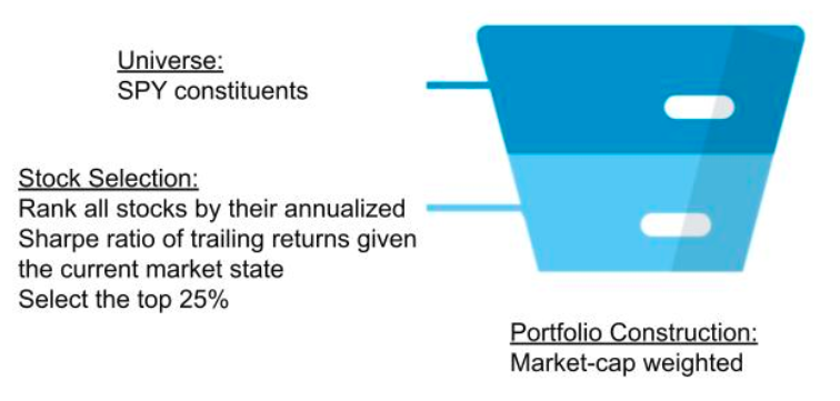
Out of Sample ResultsThe out of sample period consisted of data from September 13, 2022 to November 26, 2022. During that time, the SPY benchmark achieved a 0.43% return and a 0.569 Sharpe ratio. In contrast, the strategy achieved a 7.34% return and a 1.393 Sharpe ratio. The strategy continues to outperform the underlying benchmark ETF during the true out of sample period. Current Strategy HoldingsThe following pie chart shows the current holdings of the strategy portfolio as of November 24, 2022. I show the tickers of the 20 largest positions. 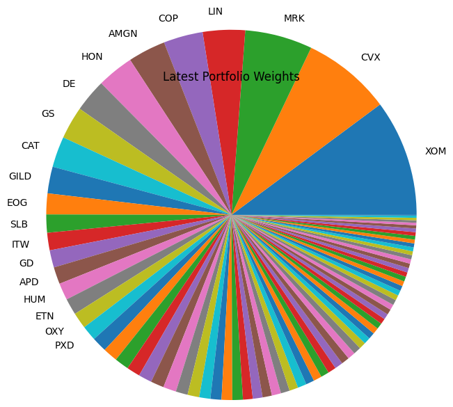
To get the entire list of portfolio weights, see the attached backtest below. The portfolio weights will likely adjust when the universe changes or the next CPI data point is released. The BLS website says we can expect the next CPI release on December 13, 2022. Strategy CodeI’ve attached the strategy code below. To see the code, click the Code tab. To run the strategy yourself, click Clone. |
|
|
|
|
|
|---|